Official Sports Kicks Off a New, Secure Store

Official Sports e-commerce website design by Lee Willett / Studio 23

official_sports_web
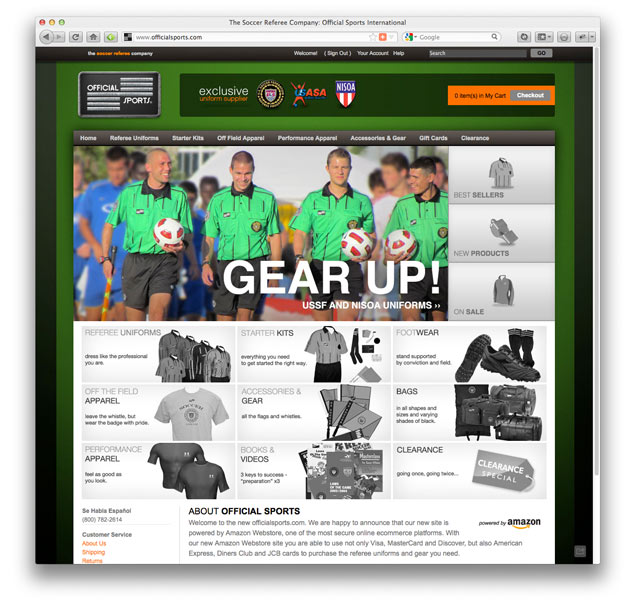
How important is security to your company? Official Sports hired a developer to create a secure e-commerce store for their soccer referee gear store. Unfortunately, they found that the site had been compromised and credit card data was stolen. That’s when they called Studio 23.We reviewed the situation and developed a game plan. We were able to access the store files, scrub any user data and get the site back quickly as a brochure. We assessed existing e-commerce options and knew that whatever system we would recommend would be very secure but also be recognized as a secure brand by customers. Ultimately, we recommended using Amazon’s webstore platform. We developed a new look and feel to the store to reassure visitors that the store was, in fact, new. We worked with the client in porting catalog records and images into the new platform, creating promotions and a special holiday shop just in time for their annual sale.

By the time the holiday sale concluded, the company saw an increase in sales of 11% over the previous year—an impressive increase considering the circumstances. We’d call that a big win but you be the referee and visit the site at OfficialSports.com.

Studio 23 Launches New Coffee Site

National Coffee Association Website by Lee Willett / Studio 23

ncausa_web2The National Coffee Association of USA hired Studio 23 to redevelop its website that serves the coffee trade as a resource of timely information, events and governmental affair initiatives. The site uses a proprietary content management system with components for member accounts, registrations and store. The original site contained considerable archived articles but distinguishing the archives from the current articles was a challenge to visitors. Also, the original site had limited navigational items and poor organization that inhibited access.

We evaluated the current structure and recommended that we continue to use the existing CMS. While not ideal, changing to a new platform would have been prohibitively expensive and would have required retraining by the organization’s support staff resulting in a loss of time. What we did was to re-architect the site, creating a clear two-tier navigation structure based on areas of expertise. Further, to promote these areas, we developed a rotating masthead that greets visitors with the most important news or events that the organization has to offer. Since the site was performing well with regard to search engine optimization, we made sure that the most visited pages gained in accessibility and older pages moved into archive areas where content was accessible but not primary.

Further, to make the site easily managed, we developed robust style sheets and an image module that is a standard size throughout the site. As a result, one size can be used everywhere thus limiting time creating multiple sizes of graphics.

Since the launch, we’ve watched the site’s visitors grow by 30% and retention increase as well. Check it out at ncausa.org.

NYC Swim Dives in to Social Media

NYC Swim Twitter Page Customization by Lee Willett / Studio 23

NYCswim_twitter2_550NYC Swim, an organization that raises money by organizing swims in the waters around Manhattan, wanted a way to communicate with participants quickly and easily to promote their events and to give them updated information about swims. While they already had a Twitter account, it was underutilized and bore no resemblance to the organization’s yearly promotional campaign graphics.

Studio23 created a fresh look for their Twitter page based on the established graphics that were to be introduced for the upcoming season. With this idea in mind, the page was conceived to change annually and, during the off season, would be replaced with photos of the previous year’s events.

Since launch, the number of followers has steadily increased, but more importantly, it has allowed our client to create a dialog with their users quickly, easily and effectively. And in case you’re in Manhattan in the summer and see a group of swimmers in the water, one of them might be from Studio 23.

Studio 23 Wins Core77 Poster Contest

Conservation Poster by Lee Willett / Studio 23

ConservePosterStudio 23 is proud to announce its poster submission to Core77.com’s Sustainable Refrainables competition has been awarded a jury prize by the Core77 design community. Over 400 entries were submitted and ours was voted fourth most popular meaning the poster will be produced as transit shelters that will be displayed in San Francisco for one week prior and during Design Week in San Francisco, June 13-19, 2011. If you’re in the city in mid June, keep an eye out for our poster.

Project
Create a poster with the phrases that move people toward sustainable design and business solutions.

Background Info
Core77 collaborated with the San Francisco chapter of AIGA to support their fourth biennial Compostmodern conference. The conference, dedicated to promoting and inspiring sustainable design solutions, is geared to established design firms and advertising agencies, emerging designers, design students and strategists who are interested in cultivating sustainable design by becoming catalysts for cultural, social and ecological transformation. Compostmodern 2011 will explore the current and future potential for ecologically sustainable growth and responsible design, focusing on real world solutions and practical applications of design thinking.

Task Definition
“Sustainable Refrainables” is a poster design competition celebrating words of persuasion. Designers tell stories. We use those stories to convey complex ideas in an engaging and meaningful way. One of those most complex ideas we deal with is about sustainable design—how to do it creatively, and how to garner support from our clients to do it effectively. Frameworks can get dry very quickly. Case studies can only take you so far. Often times, what we really need is a powerful opening salvo to jumpstart the dialogue.

The Compostmodern Core77 Design Competition invites designers to share those mantric phrases they find most powerful in communicating positive action. Maybe the phrase is something as simple as “I never use the word ‘sustainability.'” or “The first rule is listen. The second rule is to ignore what you heard and do it better.” or “There is no silver bullet, just silver buckshot.” Whatever your magic phrase, design it up in poster form, upload it to the competition site, and comment on your favorites. We’re looking for your most graphic, persuasive quotables!

All five winners will have their posters produced as transit shelters that will be displayed in San Francisco for one week prior and during Design Week in San Francisco, June 13-19, 2011. Posters will also be produced and awarded to the winning designers.

Studio 23 Launches Disfluency.com

Disfluency Web Magazine Design by Lee Willett / Studio 23
DisfluencyToday, Studio 23 launched a new site called Disfluency.com which contains bits and pieces of design postings from around the web loosely tied together on the theme of disfluency—the art of making things difficult. Disfluency is a break or interruption in a visual flow of elements. It implies a disjointed nature of elements which can lead to effective or disastrous communications as a result. On the one hand, creating messages that challenge the reader can make those messages more effective and memorable. However, too little structure leads to chaos and anarchy. The right balance is the goal of any good designer. Stay tuned.

New Mobile Sites for Clients

Mobile Website Designby Lee Willett / Studio 23

Along with our usual web design and developement services, Studio 23 now offers custom mobile website design for our clients. Mobile-optimized sites are created to load faster, navigate easier and read better than a traditional site which often requires pinching and zooming to view content.

But is this an iPhone app? No. But that’s a common question. Some clients ask us to build iPhone apps when, really, what they want is a mobile presence. iPhone apps are great but they’re also proprietary and only work on the iPhone, iPod Touches and iPads. Mobile  websites, however, are HTML-based, just like a desktop site, and can be viewed on Apple products as well as Blackberries, Android and Windows mobile phones. The advantages are that development time is faster, visitors don’t need to download a special app through a storefront, updates are made at the same time content on the site is updated, and companies can promote the mobile site just as they do their traditional URL.

While only a fraction of the traffic we see comes from mobile devices, our clients like to think ahead. We’re right there with them.

A Styleworks Upgrade

After two years of being in service, StyleWorks of Union Square wanted a fresh look to their website design. The old site, while still functioning, used older photos and a richer color scheme than the fresher look the client wanted to portray. That gave Studio 23 the ability to make some upgrades to the back end as well and promote the client’s social media links more prominently. The first thing we did was to install the latest version of Joomla content management system and port much of the content from the existing site.

Next, we designed a lighter and more open look and feel to the website while keeping accents in the client’s signature red. Once the framework was created, the client asked that we add new functions to promote her Skype consultations, her new blog, and new image training products. We also added more robust analytics and are working on an ongoing basis on optimizing page rank and search engine performance. Because we know that no matter how nice the website design is, what’s important is what the design does—builds clients.

So far, our client is thrilled with her stylish new look that just happens to fit perfectly.

A New Site for Aino Education

Aino Education Website Design by Lee Willett / Studio 23

news_ainoStudio 23 is excited to be working with Aino Education on the launch of their company and the development of their identity, website design and collateral materials. Owner Colin Greene knew he wanted an identity that was clean and simple and a website that was flexible enough that it could be changed and updated quarterly has his programs expanded. Studio 23 responded by creating a simple identity and a site that uese bold colors and lots of white space to highlight the client’s text. But creating a great design is only the start.

Once launced, Studio 23 is working to tweak the site’s keywords and meta data to improve search engine optimization. By following the traffic and trends of the site, we’re able to optimize search results and drive visitors. Since the site’s launch, we’ve been tracking the data, changing the website design to improve performance, adding and changing pages as necessary. To that end, we can say that building this site has been an education.

A New Mark for Lewisboro Library

Lewisboro Library Identity

LewisboroLibraryThe Lewisboro Library is perceived as a local resource by the community it serves. The Library, in fact, is a vibrant hub of activity offering programs, internet connection, books, videos and music from any of the libraries in the Westchester Library System. In addition, the Library was embarking on a new fundraising campaign and wanted a fresh identity to communicate a sense of tradition and a preparedness for the future.

Studio 23 created a logo that combines traditional and electronic elements to convey both a sense of past and future.

Simbiosis Multicultural Marketing

Simbiosis Website Design by Lee Willett / Studio 23

How do you connect with potential clients when your business is all about making connections? You hire Studio 23 to design and build a website that’s simple, clean, and allows you to update it and make changes easily.

The startup company Simbiosis serves as a bridge to foster new business connections between companies and agencies in the Latino and multicultural markets. As such, they needed a site where potential clients could learn more about the company, serving as a lead generator. Tony Dagnery, Simbiosis’s President, knew what he needed but because he was starting up, was afraid his costs would be prohibitive. Fortunately, he is also very hands-on and once the website site was set up, he was able to make changes as necessary, thus saving time and money.

And how is Simbiosis today? It’s making connections.